Case Study
Immigration Commons
Creating a Technical Haven in the Immigration Field

How can we amplify the impact of nonprofits and local governments in the immigration field through technology?
COMPANY
Confidential
SKILLS
MVP Design
Design System
Project Scoping/ Mapping
Usability Testing
Wire-framing
Prototyping
DURATION
Sep 2023 - Present
ROLE
A Founding UX Designer
Background
Immigration organizations have been expanding their capacities to serve, organize, and advocate especially as we see historic case loads in the US Immigration Court System. However information normally comes from anecdotal observations and leads to misinformation in the immigration field.
Solution
Our team identified this as an opportunity to provide a robust dashboard and chatbot for more comprehensive understanding of the immigration landscape. The tool delivers faster, updated, and more detailed information on demographics and legal proceedings, allowing users to analyze data based on time and identify trends important to their work.


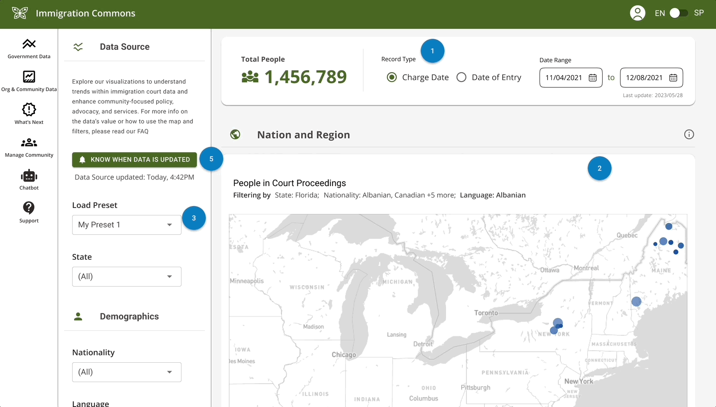
MVP Designs Including Data dashboard, data visualizations, population map, and filters
UX Research
In order to explore and gain a full understanding of the problem space, our team conducted months of research including user interviews and competitive analysis.
Users
Our users include:


Immigration Advocacy Organizations
Immigration Non-Profits
Direct Service Providers such as Lawyers
Policy Advocates
Findings
We found that:
-
Data often used within immigration is out of date, sometimes up to decades old
-
Demographics of recently-arrived immigrants, legal proceedings patterns, and strategic resource leveraging, primarily comes from fragmented sources like TRAC or US census data, not painting the full picture
-
While data from the Executive Office of Immigration Review (EOIR) is up to date, the format of the information makes it virtually impossible for organizations to use it
We hypothesized that up to date data within immigration is severely lacking due to a lack of resources and inability for users to easily manipulate and search for specific information.
Design Challenge
The team envisioned an entirely new platform, Immigration Commons, a digital hub with data and software tools for the immigration sector. Starting with EOIR data, the goal is to amplify the impact of nonprofits and local governments through technology offering innovative data insights and creating digital space for collaboration in the immigration community.
With this, I designed parts of the platform that would enhance the usage of EOIR data (data visualizations), onboarding experience, chatbot, along with the branding and styling of the product.

Finished logo and branding I created
Data Visualization
After this round of research and findings, data visualizations was our top priority. Our dashboard's primary function is showing EOIR data in an easy to read format. My objective was to conceptualize various options for users to generate their graphs.
Following comprehensive user research, our team identified a prevalent need for layering specific information over time within the data feature. Taking this into account, I developed multiple graph visualizations that empower users to customize their experience. They can choose between a line and bar graph, select their preferred time increments, and decide whether or not to include a key, aligning the tool with their unique analytical preferences.
We ensured all colors used within the product were as color blind friendly as possible.


Line and bar graph visualizations I created that are as color friendly as possible
Iterative Feedback
Once our requirements were set, we began to design multiple iterations of what this new platform could look like. After each iteration, we presented our work to various stakeholders to collect and incorporate feedback.
Some key findings:
-
Users were excited about the product, but needed assistance in how to use filters and managing users
-
There are a vast number of resources for those in the immigration sector, but no hub for people to congregate and share information
-
Many organizations working with immigrants have detailed packets that are used to help immigrants in their first days, weeks, months, or years. However these are normally over 70 pages long
With these findings in mind, we iterated and changed the scope of our project for iteration 2. This included a chatbot, detailed onboarding experience, and a community forum.
AI Chatbot
In the immigration sector, specific organizations currently maintain extensive immigration packets, but not all entities are aware of these resources. These packets, often exceeding 70 pages, contain time-sensitive and crucial information. Recognizing the challenge of navigating such voluminous content our team created a chatbot solution that efficiently taps into these packets from various organizations. My goal as lead UX Designer, was to further build out chat designs. This design was iterated on multiple times as stakeholders gave feedback in user interviews. These features included -
-
Chat Log
-
Source of Materials Used in Answer
-
Option to Share
-
Option to See All Sources
-
Option to Review and Edit Responses (Admin View)

MVP chatbot interface

Admin review page of suggested edits to ai generated responses

Admin review page, changing ai generated answer for future responses
Data Notifications & Alert
Updates from the EOIR are scheduled every 30 to 60 days. User research revealed that individuals may want to stay informed about these intervals for their research or specific needs. Having a notification button on its own proved insufficient during user testing. We therefore introduced tool tips and created a larger onboarding experience.


Data notification alert before subscribing, with tooltip, after subscribing, and email user received
Onboarding Experience
Based on our prior user research, it became evident that users had a daunting initial experience entering the platform. The number of filters and a lack of immediate clarity of the data's value proposition added to this challenge. To address these concerns and create a more inviting pathway into Immigration Commons, I developed a comprehensive onboarding experience. This guided users through the intricacies of filters, data manipulation techniques, and how to invite others to join the platform.
Onboarding Prototype Animation
Branding & Styling
Logo Design:
Over a month, hundreds of logos, fonts, and styling was created, iterated, and internally tested upon until the below design was created. To create a memorable and versatile logo, I blended elements that resonate with the platform's core identity. The design fuses iconic symbols related to immigration with modern, clean lines. The result is a logo that includes a monarch butterfly, an animal most often known for its immigration between Mexico and the United States. Incorporated are tech circuits symbolizing our mission in creating accessible data and technology to the immigration field and capturing the essence of Immigration Commons.


Final branding and styling I created


Top four logos tested
Chatbot

In the immigration sector, specific organizations currently maintain extensive immigration packets, but not all entities are aware of these resources. These packets, often exceeding 70 pages, contain time-sensitive and crucial information. Recognizing the challenge of navigating such voluminous content our team created a chatbot solution that efficiently taps into these packets from various organizations. My goal as lead UX Designer, was to further build out chat designs. This design was iterated on multiple times as stakeholders gave feedback in user interviews. These features included -
-
Chat Log
-
Source of Materials Used in Answer
-
Option to Share
-
Option to See All Sources
-
Option to Upload Sources (Admin View)
Top three styling tested
Color Palette & Style Guide:
Over a month, the color palette was tested and iterated upon numerous times until the below palette was created. In the process of defining Immigration Commons' visual language, I carefully selected a harmonious color palette that is now used in our style guide. This guide serves as a reference for typography, color usage, logo application, and overall design principles. By adhering to these guidelines, Immigration Commons maintains a cohesive and polished appearance, reinforcing its brand integrity.


Color palette
Takeaways
This product has recently entered production, and we have already seen important use cases from Immigration Commons. Our product has since been used in California to understand the number of people who speak a specific dialect of Spanish in order to advocate for the creation of immigration documentation in this dialect and reallocate resources for this community.