CASE STUDY
New England Metabolic Consortium
Creating a new normal in health care resources

Overview
The New England Consortium, spearheaded by Boston Children Hospital physicians, is a collective of metabolic doctors, researchers, nutritionists, and other healthcare professionals in the Northeast creating educational and professional materials for families, educators, and professionals alike. Once a year, this collective comes together for their annual Consortium. The NEMC is a leading resource in the field for families and professionals alike.
The current New England Consortium website is difficult to navigate and disorganized. I created a new design and web flow for a more cohesive experience enabling professionals and families alike to find pertinent information faster
Client: Boston Children's Hospital
Status: Near Completion
Role: Design Researcher, UX Designer
The Challenge
-
The New England Metabolic Consortium needs a new website design and webflow
-
The website is used to showcase a conference for Metabolic professionals throughout the Northeast and is a hub of information for families, professionals, and educators on metabolic disorders such as PKU, Galactosemia, Citrullinemia, and many others.
-
While all information is on the website, information is difficult to find for people due to navigation difficulty and an abundance of text
The Outcome
-
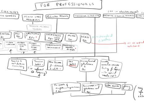
I proposed replacing the previous website with a new web flow based on diseases instead of persona as this caused major duplication and nesting throughout the site.
-
The website was redesigned in an effort to increase intuitiveness for diseases resources, additional resources, and the consortium itself along with improving web design, scalability, and overall experience for people.
-
I re-designed the website to support the Consortium’s goals by providing a comprehensive experience as a response to the most common user needs and wants.
Focus groups were conducted on 7 people who fell into one of the following three categories
The Metabolic Medical Professional - someone who relies on this site for up to date information on the New England Consortium and new information and resources for their own patients and hospitals.
The General Physician - someone who relies on this website for up to date metabolic protocols to use in their own clinics as many hospitals do not have a metabolic or genetics department though immediate aid many be needed for these patients.
The Caregiver - Someone who is a caretaker of a recently diagnosed child of a metabolic disease and hopes to learn more information with additional resources for education.
Research
Initial Web Flow
Re-Designed Web flow
Based on our user interviews, we found users wanted an intuitive way of finding pertinent information, a dedicated section for outside resources, and quick access to critical information that may be used in a clinical setting. I focused on building out each of these features.
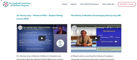
The initial design before I began this project with is shown below. The website includes a wide variety of information that needed a revamp from web flow, concise branding, and visual design as shown below. The website also made information more difficult to find due to its text heavy nature which was brought up throughout most user interviews.
Initial Website
Design
.png)
.png)
.png)
.png)
Iterated
Design
Usability tests revealed a number of problems with the website's navigation and interface.
Feedback was given by a team of five other consortium members, a general pcp, and a family member of an individual with a rare genetic disease. I created boxes with the title name that when hovered over would showcase a description of the resource previously written below so webpages were less overwhelming. We chose to add a shorter survey asking for feedback from people, an emphasis on less words initially on a page, and more visuals based on user feedback.
.png)
.png)
.png)
Refined
Iterated
Design
After speaking with users, a flow based on disease instead of profession and family was desired. By changing the pages, each disease showcases all resources available on the website sectioned by intended audience with additional broad resources found in a separate section. The design also includes more white space in an effort to make the wording and function behind each page clearer. Brand colors were more effectively throughout the website through buttons, footer, etc.
.png)
.png)
.png)
.png)
Final Design
After running usability tests, peer feedback, and analyzing analytics, we decided to add a section specific to the Acute Illness Protocols. This section is specific towards professionals in the field to implement in their own hospitals and also are the only resource for a number of diseases. By consolidating the Acute Illness Protocol diseases, a quicker search is created for professional.
We also decided to create simple buttons for people to click on instead of a hover description creating an easier experience for people. Since each page has a summary above, people can instead click on and learn more afterwards. I also included more visual feedback to communicate what page the user is currently viewing and changed some of the colors and tweaked other small visual aspects to create a more cohesive and consistent visual language.
.png)
.png)
.png)
.png)


